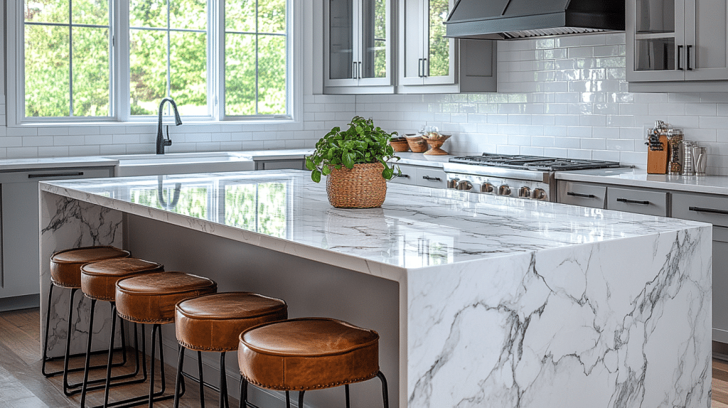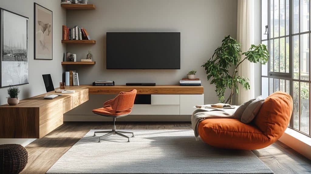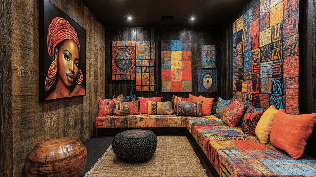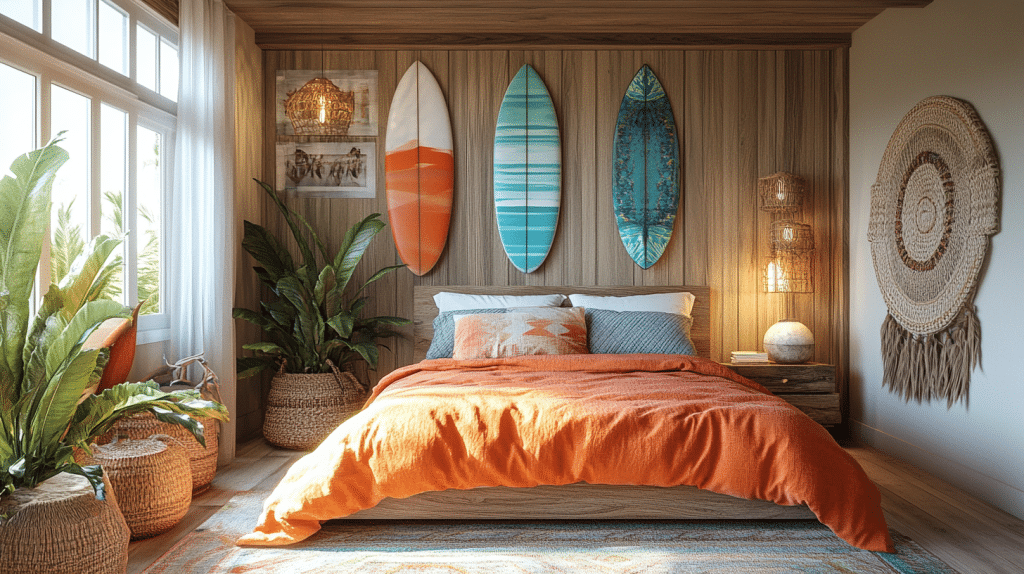
Picking three colors that go together is easier once you fix one as the quiet base. I let two shift with the season and keep the third steady across the room.
Finding the perfect color combination can feel like solving a complex puzzle. But what if I could unlock the secret to creating breathtaking color palettes that instantly elevate your design?
The Art of Color Harmony: Mastering Triadic Palettes
Colors aren’t just random choices – they’re a strategic dance of visual emotion. Let me break down three show-stopping color combinations that designers and artists swear by:
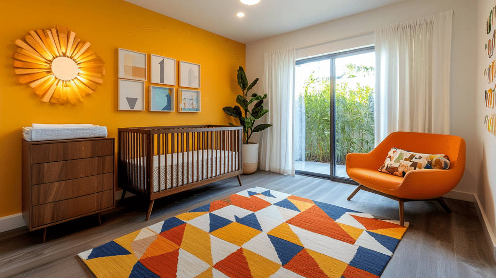
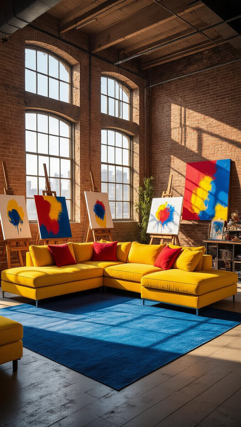
1. Classic Triadic Triumph: Yellow, Red, and Blue
- Energetic and bold
- Perfect for spaces that need a creative spark
- Ideal for:
- Children’s rooms
- Art studios
- Playful living areas
2. Bold and Balanced: Green, Orange, and Purple
- Unexpected yet harmonious
- Creates visual drama
- Best for:
- Modern design spaces
- Statement rooms
- Creative professional environments

3. Sophisticated Chic: Teal, Magenta, and Gold
- Elegant and contemporary
- Blends cool and warm tones
- Excellent for:
- Luxury interiors
- Professional branding
- Trendsetting spaces

Pro Design Tip
Always choose one color as your dominant tone, using the others as strategic accents. This approach ensures visual balance and prevents overwhelming your space.
Bonus Combinations to Explore
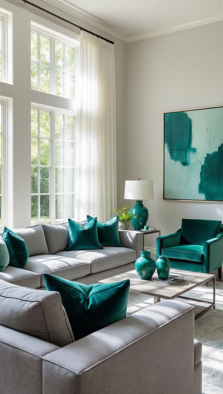
- Graystone, teal, and emerald (natural sophistication)
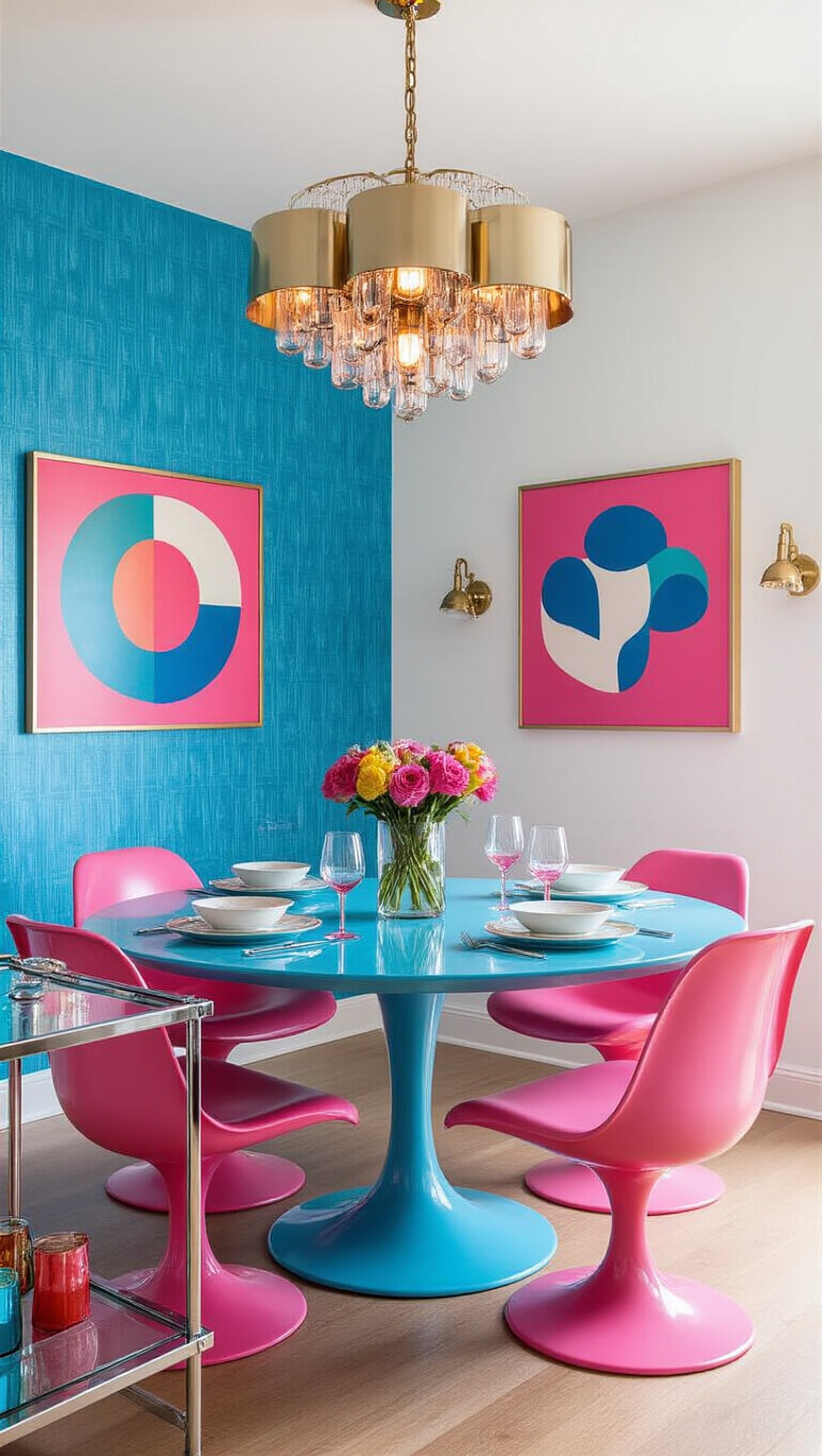
- Electric pink, azure, and powder blue (retro playfulness)
- Dark navy, scarlet red, and lemon yellow (high-contrast drama)
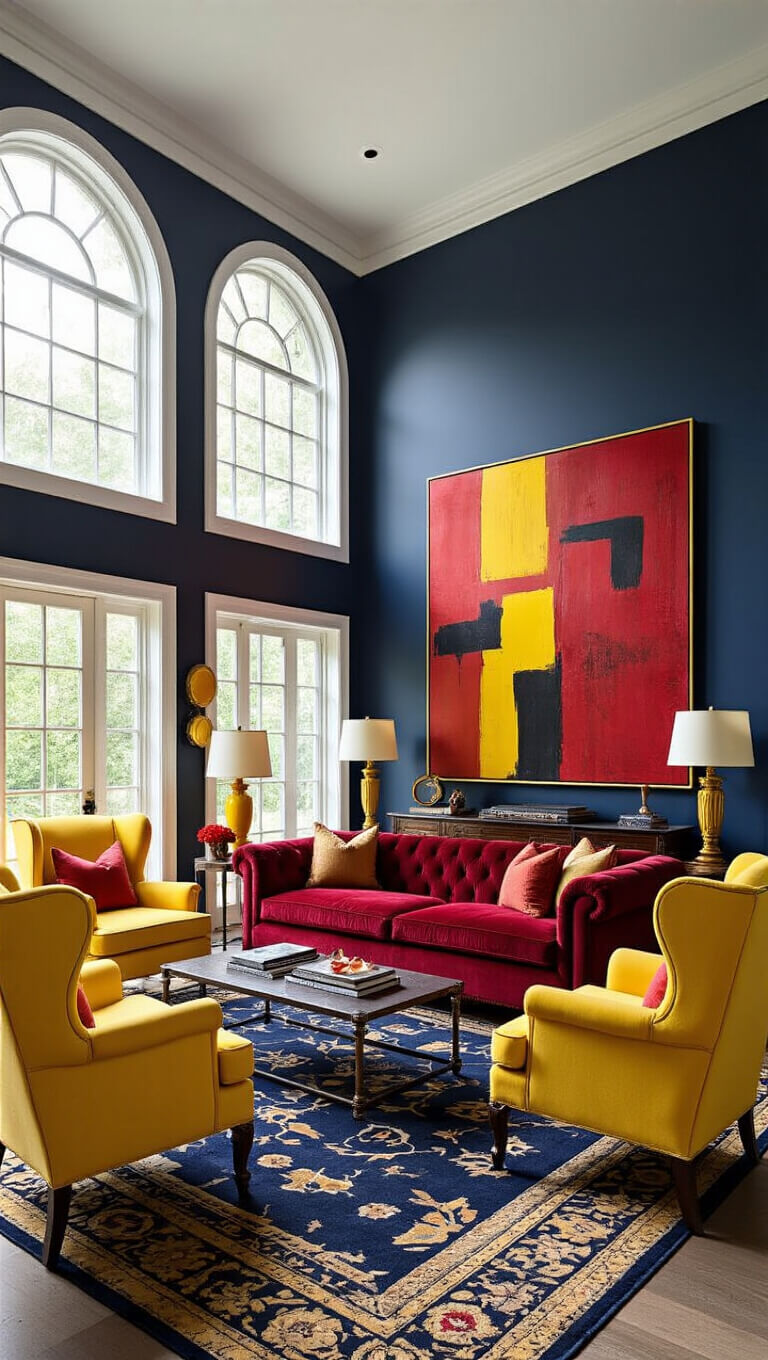
Color Pairing Strategy
- 60% dominant color
- 30% secondary color
- 10% accent color
The rooms that hold up best are planned around daily habits. Pick the changes that fit how you live and the space feels right for years.